
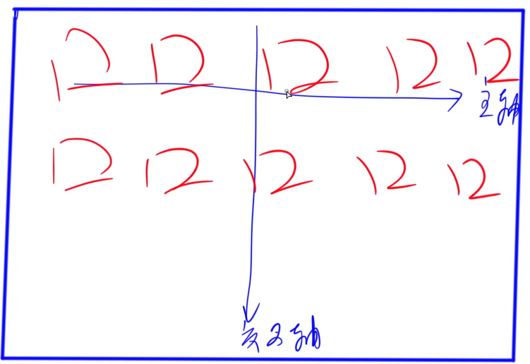
1.13 flex布局
index.html
<!DOCTYPE html>
<html lang="en">

<head>
    <meta charset="UTF-8">
    <meta http-equiv="X-UA-Compatible" content="IE=edge">
    <meta name="viewport" content="width=device-width, initial-scale=1.0">
    <title>Document</title>
    <link rel="stylesheet" href="/static/css/style.css" type="text/css">
</head>

<body>
    <div class="div-flex">
        <div class="div-flex-item">1</div>
        <div class="div-flex-item">2</div>
        <div class="div-flex-item">3</div>
        <div class="div-flex-item">4</div>
        <div class="div-flex-item">5</div>
        <div class="div-flex-item">6</div>
        <div class="div-flex-item">7</div>
        <div class="div-flex-item">8</div>
        <div class="div-flex-item">9</div>
        <div class="div-flex-item">10</div>
    </div>
</body>

</html>
style.css
/*
align-items 与 align-content的区别
1. align-items 会将所有的盒子按照均匀排布 align-content会挤在一起
2. 当在flex-wrap:nowrap模式的时候,align-items:center 仍然会垂直居中,而algn-content:center 居中效果会消失
flex好处:平时在对齐元素的时候更方便竖直居中
*/
/*
div水平居中:
    margin:0 auto;
竖直居中:
    position: relative;
    top: 50%;
    transform: translateY(-50%);

div居中:
    position: relative;
    相对于起点向下偏移50%,相对于起点向右偏移50%
    top: 50%;
    left: 50%;
    向上和向左平移自身的50%
    transform: translate(-50%, -50%);

使用flex实现div居中:
    display:flex;
    justify-content: center;
    align-items: center;
*/
.div-flex {
    width: 50%;
    height: 500px;
    background-color: lightgrey;
    display: flex;
    /* 从右往左摆 */
    /* flex-direction: row-reverse; */
    /* flex-wrap: wrap; */
    flex-flow: row nowrap;
    /* justify-content: center;
    align-items: stretch;
    align-content: center; */

    justify-content: center;
    /* align-items: center; */
}

.div-flex-item {
    width: 100px;
    height: 100px;
    /* flex-basis: 500px; */
    flex: none;
}

.div-flex-item:nth-child(odd) {
    background-color: lightpink;
    /* order: 1; */
    /* 当宽度变大的时候,所有的容器等比例放大 */
    /* flex-grow: 3;
    flex-shrink: 3; */
}

.div-flex-item:nth-child(even) {
    background-color: lightgreen;
    /* order: 2; */
    /* flex-grow: 1;
    flex-shrink: 1; */
}
1.14 响应式布局
index.html
<!DOCTYPE html>
<html lang="en">

<head>
    <meta charset="UTF-8">
    <meta http-equiv="X-UA-Compatible" content="IE=edge">
    <meta name="viewport" content="width=device-width, initial-scale=1.0">
    <title>Document</title>
    <link rel="stylesheet" href="/static/css/style.css">
</head>

<body>
    <div class="container">
        <!-- <div class="card"></div> -->
        <div class="row">
            <div class="col col-md-2 col-sm-6">1</div>
            <div class="col col-md-4 col-sm-4">2</div>
            <div class="col col-md-6 col-sm-2">3</div>
            <div class="col col-md-6 col-sm-12">用户名</div>
            <div class="col col-md-6 col-sm-12">密码</div>
            <div class="col col-md-12 col-sm-12">个人简介</div>
        </div>
    </div>
</body>

</html>
style.css
.container {
    background-color: lightgrey;
    width: 80%;
    margin: 0 auto;
    padding: 10px;
    height: 100vh;
}

.card {
    width: 80%;
    /* vh是相对于视窗高度的百分比 */
    height: 100vh;
    background-color: blueviolet;
    margin: 0 auto;
}

@media (min-width:768px) {
    .card {
        background-color: aquamarine;
    }
}

@media (min-width:992px) {
    .card {
        background-color: chartreuse;
    }
}

@media (min-width:1200px) {
    .card {
        background-color: brown;
    }
}

.col {
    width: 33.33%;
    float: left;
    height: 100px;
    background-color: lightsalmon;
    border: 1px solid black;
    font-size: 30px;
    color: white;
    text-align: center;
    line-height: 100px;
    box-sizing: border-box;
}

/* 当最小宽度大于等于768px时,才应用下面的样式 */
@media (min-width:768px) {


    /* 平均分成12份:1/12 */
    .col-md-1 {
        width: 8.3333333%;
    }

    /* 平均分成6份:2/12 */
    .col-md-2 {
        width: 16.6666667%;
    }

    /* 3/12 */
    .col-md-3 {
        width: 25%;
    }

    /* 4/12 */
    .col-md-4 {
        width: 33.3333333%;
    }

    /* 5/12 */
    .col-md-5 {
        width: 41.6666667%;
    }

    /* 6/12 */
    .col-md-6 {
        width: 50%;
    }

    /* 7/12 */
    .col-md-7 {
        width: 58.3333333%;
    }

    /* 8/12 */
    .col-md-8 {
        width: 66.6666667%;
    }

    /* 9/12 */
    .col-md-9 {
        width: 75%;
    }

    /* 10/12 */
    .col-md-10 {
        width: 83.3333333%;
    }

    /* 11/12 */
    .col-md-11 {
        width: 91.6666667;
    }

    /* 12/12 */
    .col-md-12 {
        width: 100%;
    }
}

/* 当屏幕宽度小于等于767px的时候应用下面的样式 */
@media (max-width:767px) {

    /* 平均分成12份:1/12 */
    .col-sm-1 {
        width: 8.3333333%;
    }

    /* 平均分成6份:2/12 */
    .col-sm-2 {
        width: 16.6666667%;
    }

    /* 3/12 */
    .col-sm-3 {
        width: 25%;
    }

    /* 4/12 */
    .col-sm-4 {
        width: 33.3333333%;
    }

    /* 5/12 */
    .col-sm-5 {
        width: 41.6666667%;
    }

    /* 6/12 */
    .col-sm-6 {
        width: 50%;
    }

    /* 7/12 */
    .col-sm-7 {
        width: 58.3333333%;
    }

    /* 8/12 */
    .col-sm-8 {
        width: 66.6666667%;
    }

    /* 9/12 */
    .col-sm-9 {
        width: 75%;
    }

    /* 10/12 */
    .col-sm-10 {
        width: calc(100%*10/12);
    }

    /* 11/12 */
    .col-sm-11 {
        width: calc(100%*11/12);
    }

    /* 12/12 */
    .col-sm-12 {
        width: calc(100%*12/12);
    }
}
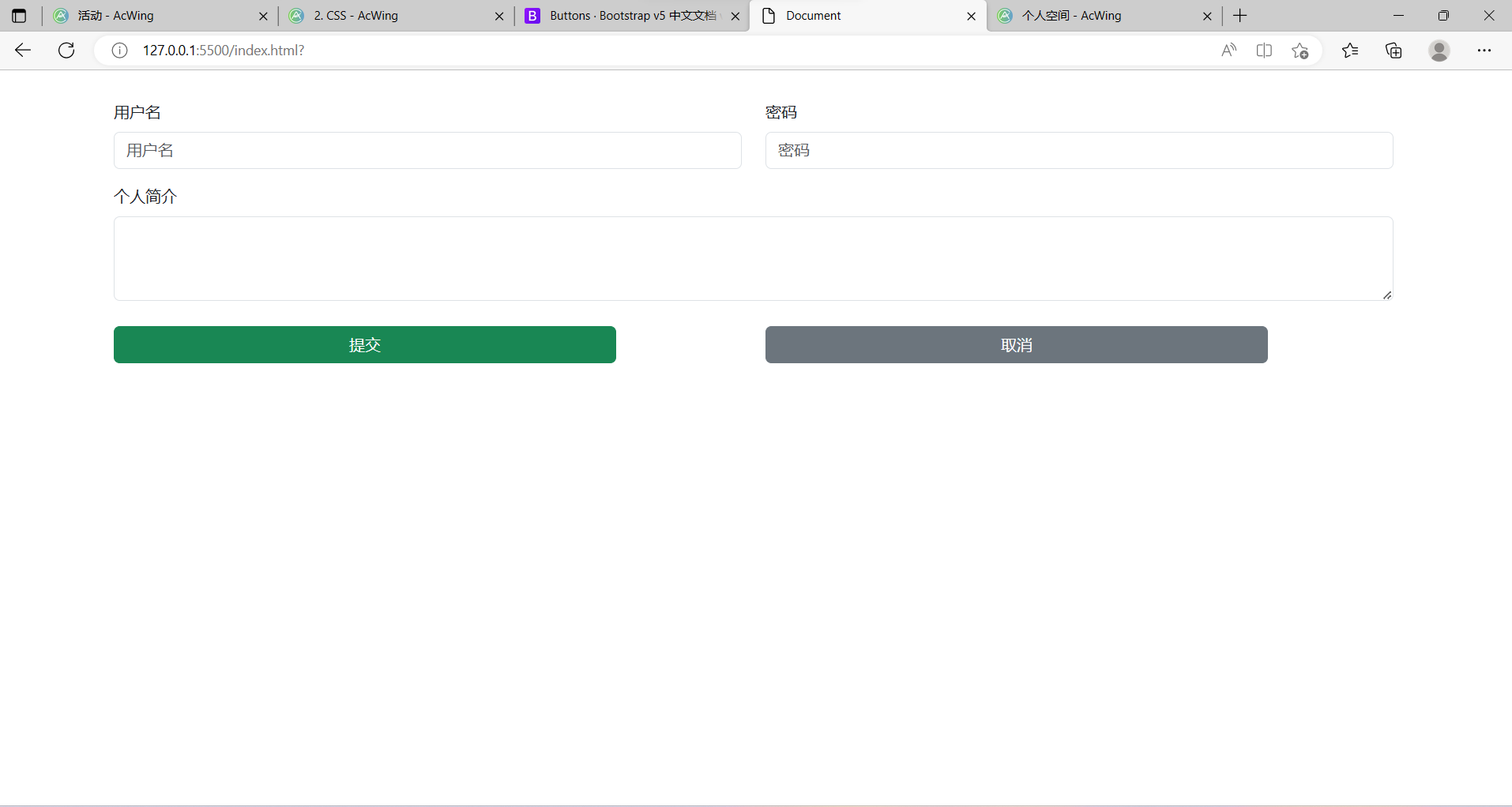
例子(Bootstrap用法)
- 下载压缩包
- 解压到项目对应的文件夹
- 例如:在static文件夹中新建一个文件夹third-party,如何将bootstrap-5.3.0-alpha1-dist解压到当前文件夹
- 在index.html中引入css和js
<link rel="stylesheet" href="/static/third-party/bootstrap-5.3.0-alpha1-dist/css/bootstrap.min.css"><script src="/static/third-party/bootstrap-5.3.0-alpha1-dist/js/bootstrap.min.js"></script>
效果图:
index.html
<!DOCTYPE html>
<html lang="en">

<head>
    <meta charset="UTF-8">
    <meta http-equiv="X-UA-Compatible" content="IE=edge">
    <meta name="viewport" content="width=device-width, initial-scale=1.0">
    <title>Document</title>
    <link rel="stylesheet" href="/static/third-party/bootstrap-5.3.0-alpha1-dist/css/bootstrap.min.css">
    <script src="/static/third-party/bootstrap-5.3.0-alpha1-dist/js/bootstrap.min.js"></script>
</head>

<body>
    <div class="container">
        <form>
            <div class="row" style="margin-top: 30px;">
                <!-- 如果只定义了xs并没有定义sm的话,那么sm也会应用xs定义的长度
                也就是说,这里只定义了md,lg和xl并没有定义,那么lg和xl会延用md的定义 -->
                <div class="col-md-6 col-xs-12">
                    <div class="mb-3">
                        <label for="username" class="form-label">用户名</label>
                        <input type="test" class="form-control" id="username" placeholder="用户名">
                    </div>
                </div>
                <div class="col-md-6 col-xs-12">
                    <div class="mb-3">
                        <label for="password" class="form-label">密码</label>
                        <input type="password" class="form-control" id="password" placeholder="密码">
                    </div>
                </div>
                <div class="col-xs-12">
                    <div class="mb-3">
                        <label for="exampleFormControlTextarea1" class="form-label">个人简介</label>
                        <textarea class="form-control" id="exampleFormControlTextarea1" rows="3"></textarea>
                    </div>
                </div>
                <div class="col-md-6 col-xs-12">
                    <button class="btn btn-success" style="width: 80%; margin-top: 10px;">提交</button>
                </div>
                <div class="col-md-6 col-xs-12">
                    <button class="btn btn-secondary" style="width: 80%; margin-top: 10px;">取消</button>
                </div>
            </div>
        </form>
    </div>
</body>

</html>