1 css实现
media查询:当屏幕宽度满足特定条件时应用css
把一行分为12小块(因为12因子多)
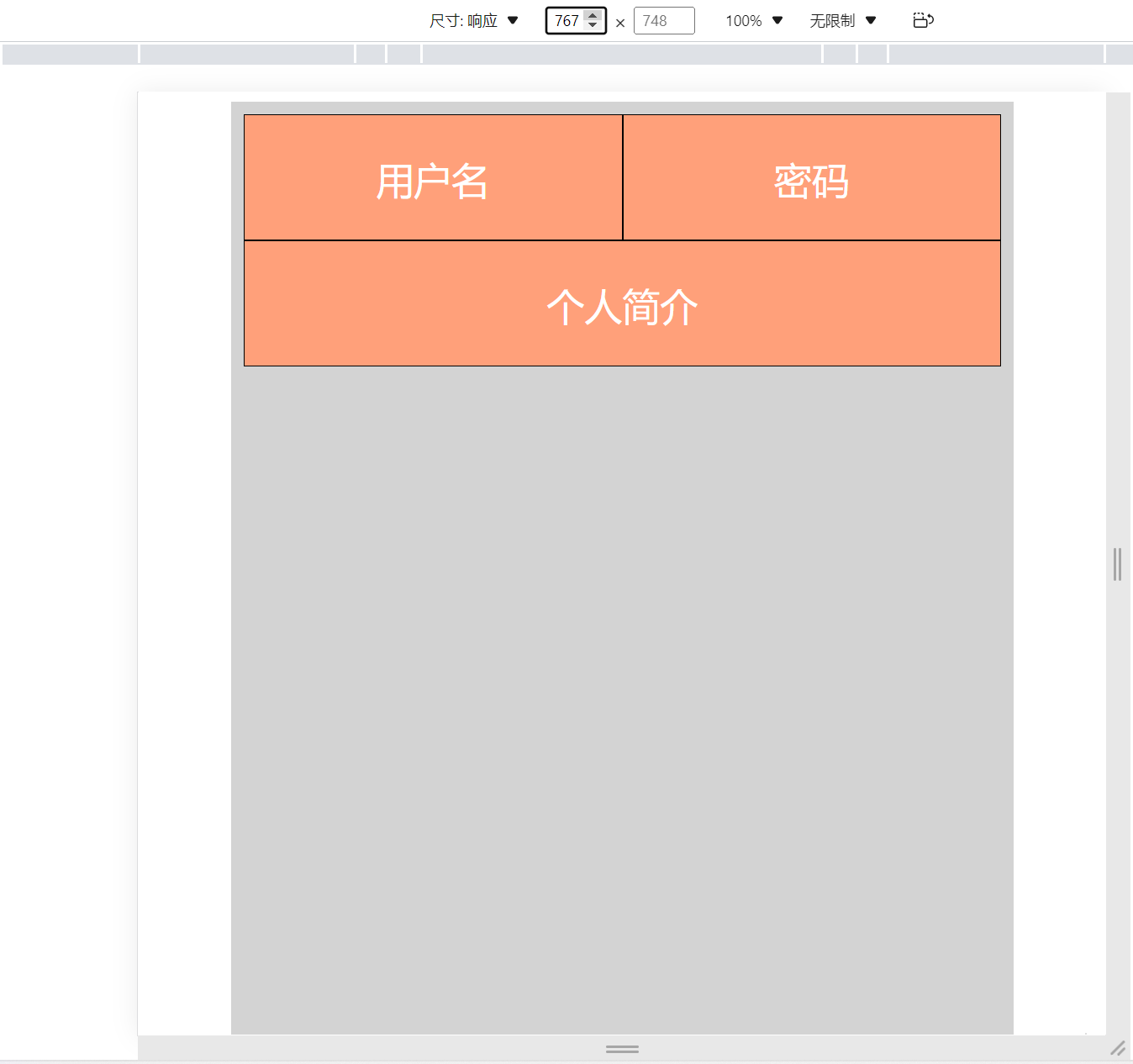
实现屏幕宽度大于等于768px时,用户名,密码在一行,个人简介另起一行
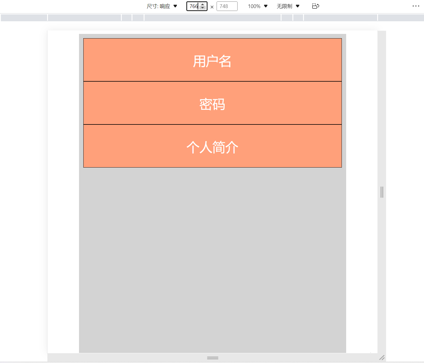
屏幕宽度小于768px时,用户名,密码,个人简介都令起一行
responsive.html
<!DOCTYPE html>
<html lang="en">
<head>
    <meta charset="UTF-8">
    <meta http-equiv="X-UA-Compatible" content="IE=edge">
    <meta name="viewport" content="width=device-width, initial-scale=1.0">
    <title>Document</title>
    <link rel="stylesheet" href="/static/css/responsive.css">
</head>
<body>
    <div class="container">
        <div class="row">
            <div class="col col-md-6 col-sm-12">用户名</div>
            <div class="col col-md-6 col-sm-12">密码</div>
            <div class="col col-md-12 col-sm-12">个人简介</div>
        </div>
    </div>
</body>
</html>
responsive.css
.container {
    background-color: lightgray;
    width: 80%;
    margin: 0 auto;
    padding: 10px;
    height: 100vh;
}

.col {
    float: left;
    height: 100px;
    background-color: lightsalmon;
    border: 1px solid black;
    font-size: 30px;
    box-sizing: border-box;
    color: white;
    text-align: center;
    line-height: 100px;

}

@media (min-width: 768px) {
    .col-md-1 {
        width: 8.3333333%;
    }

    .col-md-2 {
        width: 16.6666667%;
    }

    .col-md-3 {
        width: 25%;
    }

    .col-md-4 {
        width: 33.3333333%;
    }

    .col-md-5 {
        width: 41.6666667%;
    }

    .col-md-6 {
        width: 50%;
    }

    .col-md-7 {
        width: 58.33333333%;
    }

    .col-md-8 {
        width: 66.66666667%;
    }

    .col-md-9 {
        width: 75%;
    }

    .col-md-10 {
        width: 83.3333333%;
    }

    .col-md-11 {
        width: 91.66666667%;
    }

    .col-md-12 {
        width: 100%;
    }
}

@media (max-width: 768px) {
    .col-sm-1 {
        width: 8.3333333%;
    }

    .col-sm-2 {
        width: 16.6666667%;
    }

    .col-sm-3 {
        width: 25%;
    }

    .col-sm-4 {
        width: 33.3333333%;
    }

    .col-sm-5 {
        width: 41.6666667%;
    }

    .col-sm-6 {
        width: 50%;
    }

    .col-sm-7 {
        width: 58.33333333%;
    }

    .col-sm-8 {
        width: 66.66666667%;
    }

    .col-sm-9 {
        width: 75%;
    }

    .col-sm-10 {
        width: 83.3333333%;
    }

    .col-sm-11 {
        width: 91.66666667%;
    }

    .col-sm-12 {
        width: 100%;
    }
}
写成动态计算:
.container {
    background-color: lightgray;
    width: 80%;
    margin: 0 auto;
    padding: 10px;
    height: 100vh;
}

.col {
    float: left;
    height: 100px;
    background-color: lightsalmon;
    border: 1px solid black;
    font-size: 30px;
    box-sizing: border-box;
    color: white;
    text-align: center;
    line-height: 100px;

}

@media (min-width: 768px) {
    .col-md-1 {
        width: calc(100% * 1 / 12);
    }

    .col-md-2 {
        width: calc(100% * 2 / 12);
    }

    .col-md-3 {
        width: calc(100% * 3 / 12);
    }

    .col-md-4 {
        width: calc(100% * 4 / 12);
    }

    .col-md-5 {
        width: calc(100% * 5 / 12);
    }

    .col-md-6 {
        width: calc(100% * 6 / 12);
    }

    .col-md-7 {
        width: calc(100% * 7 / 12);
    }

    .col-md-8 {
        width: calc(100% * 8 / 12);
    }

    .col-md-9 {
        width: calc(100% * 9 / 12);
    }

    .col-md-10 {
        width: calc(100% * 10 / 12);
    }

    .col-md-11 {
        width: calc(100% * 11 / 12);
    }

    .col-md-12 {
        width: calc(100% * 12 / 12);
    }
}

@media (max-width: 768px) {
    .col-sm-1 {
        width: calc(100% * 1 / 12);
    }

    .col-sm-2 {
        width: calc(100% * 2 / 12);
    }

    .col-sm-3 {
        width: calc(100% * 3 / 12);
    }

    .col-sm-4 {
        width: calc(100% * 4 / 12);
    }

    .col-sm-5 {
        width: calc(100% * 5 / 12);
    }

    .col-sm-6 {
        width: calc(100% * 6 / 12);
    }

    .col-sm-7 {
        width: calc(100% * 7 / 12);
    }

    .col-sm-8 {
        width: calc(100% * 8 / 12);
    }

    .col-sm-9 {
        width: calc(100% * 9 / 12);
    }

    .col-sm-10 {
        width: calc(100% * 10 / 12);
    }

    .col-sm-11 {
        width: calc(100% * 11 / 12);
    }

    .col-sm-12 {
        width: calc(100% * 12 / 12);
    }
}
2 bootstrap实现
bootstrap地址
responsive.html
<!DOCTYPE html>
<html lang="en">
<head>
    <meta charset="UTF-8">
    <meta http-equiv="X-UA-Compatible" content="IE=edge">
    <meta name="viewport" content="width=device-width, initial-scale=1.0">
    <title>Document</title>
    <link rel="stylesheet" href="/static/css/responsive.css">
    <link rel="stylesheet" href="/static/third_party/bootstrap-5.1.3-dist/css/bootstrap.min.css">
    <script src="/static/third_party/bootstrap-5.1.3-dist/js/bootstrap.min.js"></script>
</head>
<body>
    <div class="container">
        <div class="row">
            <div class="col col-md-6 col-sm-12">用户名</div>
            <div class="col col-md-6 col-sm-12">密码</div>
            <div class="col col-md-12 col-sm-12">个人简介</div>
        </div>
    </div>
</body>
</html>
responsive.css
.container {
    background-color: lightgray;
    width: 80%;
    margin: 0 auto;
    padding: 10px;
    height: 100vh;
}

.col {
    float: left;
    height: 100px;
    background-color: lightsalmon;
    border: 1px solid black;
    font-size: 30px;
    box-sizing: border-box;
    color: white;
    text-align: center;
    line-height: 100px;
}
最后效果: