python数据可视化
csv文件
用到函数
reader()读取文件
next() 转入下一行
enumerate() 获取每个元素的索引及其值
打开文件读取
import csv

filename = 'sitka_weather_07-2018_simple.csv'
with open(filename) as f:
    reader = csv.reader(f)
    header_row = next(reader)//next()是转入下一行 ,这里使用以此即第一行
    print(header_row)  //打印文件头

for index,column_header in enumerate(header_row)://enumerate() 获取每个元素的索引及其值
    print(index,column_header)


提取数据
import csv

filename = 'sitka_weather_07-2018_simple.csv'
with open(filename) as f:
   reader = csv.reader(f)
   header_row = next(reader)

   highs = []
   for row in reader:
       high = int(row[5])
       highs.append(high)

print(highs)
作图
首先要升级pip并安装matplotlib
打开cmd,输入下面代码,即可升级pip,这是用镜像升级,直接升级,容易出错
python -m pip install --upgrade pip -i https://pypi.douban.com/simple
管理员身份打卡cmd,输入一下代码:
pip install matplotlib
完成安装
绘制简单折线图
import matplotlib.pyplot as plt
squares=[1,4,9,16,25]
fig,ax=plt.subplots() //fig 表示整张图片 ax表示图片中的各个图表
ax.plot(squares)
    或者ax.plot(input_values,squares,linewidth=3)  //其中input_values=[1,2,3,4,5]

plt.show()//打开Matplotlib查看器并显示绘制的图表
set_title("",frontsize=)//标题
set_xlabel("",frontsize=)
set_ylabel("",frontsize=)//坐标轴加上标题

tick_params(axis='both',labelsize=)//设置刻度标记的大小

终端输入
import matplotlib.pyplot as plt
plt.style.available
    可查询多种样式
添加plt.style.use('')
即可
散点图
scatter(x,y,c='red',s=) //散点图
或者scatter(x,y,c=(0,0.8,0),s=)//c 可以RGB颜色来定义


颜色映射
import matplotlib.pyplot as plt

x_value=range(1,1001)
y_value=[x**2 for x in x_value]

fig,ax=plt.subplots()
ax.scatter(x_value,y_value,c=y_value,cmap=plt.cm.Blues,s=5)

plt.show()
效果图:
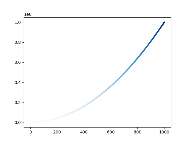
plt.savefig('figue1.png',bbox_inches='tight')可以自动保存,第二个参数是删去多余白边
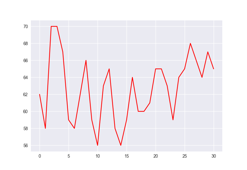
提取数据 然后做出图像
import csv

import matplotlib.pyplot as plt

with open('sitka_weather_07-2018_simple.csv') as f:
    reader = csv.reader(f)
    header_row=next(reader)
    highs=[]
    for row in reader:
        high = int(row[5])
        highs.append(high)

plt.style.use('seaborn')
fig,ax=plt.subplots()
ax.plot(highs,c='red')

plt.show()
效果图:
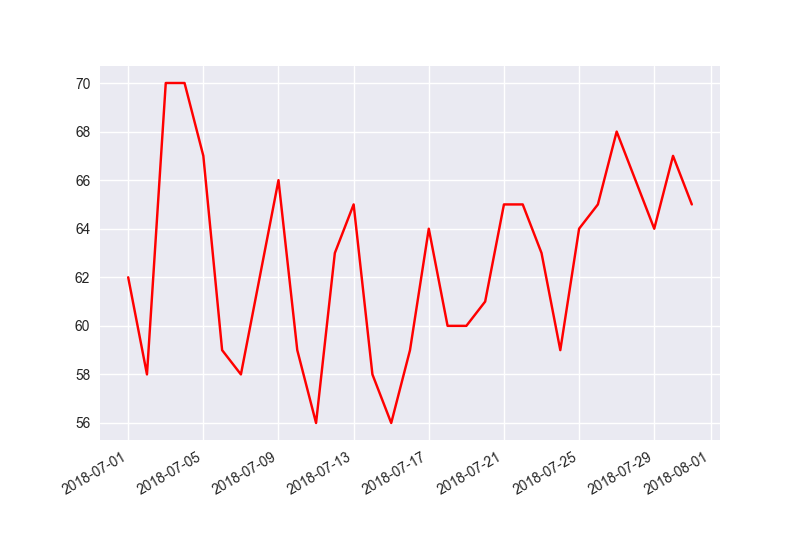
提取日期 放入图中
import csv
from datetime import datetime
import matplotlib.pyplot as plt

with open('sitka_weather_07-2018_simple.csv') as f:
    reader = csv.reader(f)
    header_row=next(reader)
    datas , highs=[],[]
    for row in reader:
        current_data = datetime.strptime(row[2],'%Y-%m-%d')
        high = int(row[5])
        highs.append(high)
        datas.append(current_data)

plt.style.use('seaborn')
fig,ax=plt.subplots()
ax.plot(datas,highs,c='red')

fig.autofmt_xdate()

plt.show()
import csv
from datetime import datetime
import matplotlib.pyplot as plt
with open('sitka_weather_2018_simple.csv') as f:
reader = csv.reader(f)
header_row=next(reader)
datas , highs , lows=[],[],[]
for row in reader:
current_data = datetime.strptime(row[2],'%Y-%m-%d')
high = int(row[5])
low = int(row[6])
highs.append(high)
datas.append(current_data)
lows.append(low)
plt.style.use('seaborn')
fig,ax=plt.subplots()
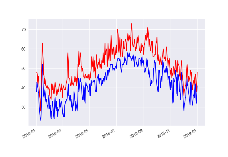
ax.plot(datas,highs,c='red')
ax.plot(datas,lows,c='blue')
fig.autofmt_xdate()
plt.show()
效果图:
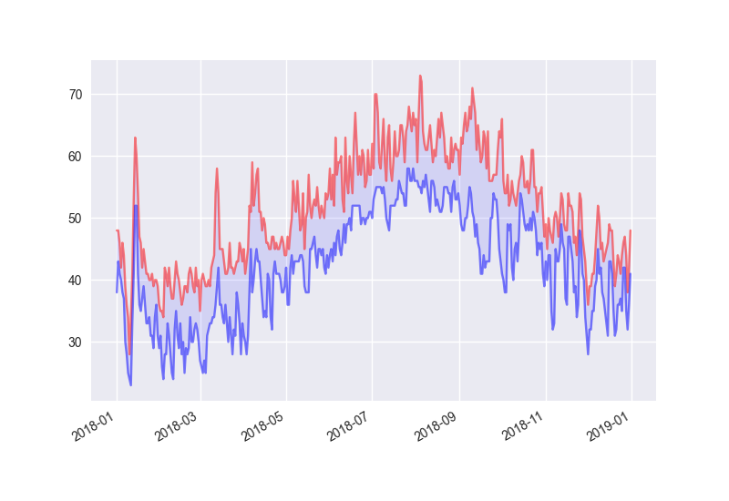
ax.plot(datas,highs,c='red',alpha=0.5)
ax.plot(datas,lows,c='blue',alpha=0.5)
ax.fill_between(datas,highs,lows,facecolor='blue',alpha=0.1)
加入上述代码后效果图:
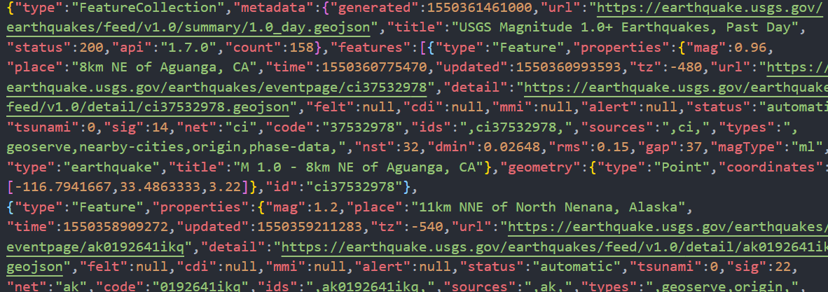
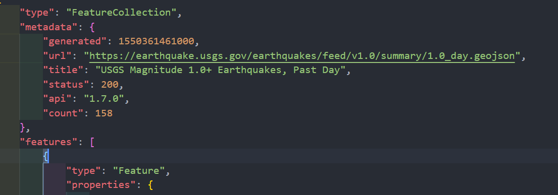
读写JOSN格式
import json

filename='eq_data_1_day_m1.json'

with open ( filename) as f:
    all_eq_data = json.load(f)

readable_file = 'readable_eq_data.json'
with open (readable_file,'w') as f:
    json.dump(all_eq_data,f,indent=4)//将all_eq_data传入文件f,indent=4让dump()使用与数据结构匹配的缩进量设置数据的格式
对比:
前
后
读取json 并提取数据画plotly图
import json
import plotly.express as px # 此处用的plotly,
filename = 'eq_data_1_day_m1.json'
with open(filename) as f:
all_eq_data = json.load(f)
all_eq_dicts = all_eq_data['features']
mags ,titles, lons, lats = [], [], [], []
for eq_dict in all_eq_dicts:
mag = eq_dict['properties']['mag']
title = eq_dict['properties']['title']
lon = eq_dict['geometry']['coordinates'][0]
lat = eq_dict['geometry']['coordinates'][1]
mags.append(mag)
titles.append(title)
lons.append(lon)
lats.append(lat)
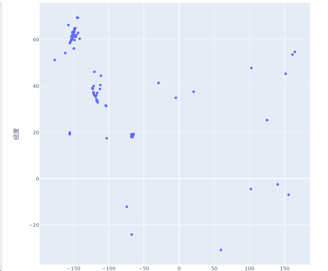
fig=px.scatter(
x=lons,
y=lats,
labels={'x':'纬度','y':'经度'},
range_x=[-200,200],
range_y=[-90,90],
width=800,
height=800,
title='全球地震散点图',
)
fig.write_html('global_earthquakes.html')#生成html文件
fig.show()
效果说生成一个html文件,其中图为下:
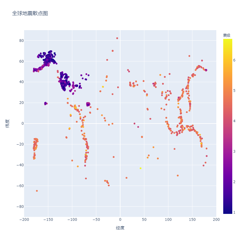
最终版
import json
import plotly.express as px
filename = 'eq_data_30_day_m1.json'
with open(filename) as f:
    all_eq_data = json.load(f)

all_eq_dicts = all_eq_data['features']

mags ,titles, lons, lats = [], [], [], []
for eq_dict in all_eq_dicts:
    mag = eq_dict['properties']['mag']
    title = eq_dict['properties']['title']
    lon = eq_dict['geometry']['coordinates'][0]
    lat = eq_dict['geometry']['coordinates'][1]
    mags.append(mag)
    titles.append(title)
    lons.append(lon)
    lats.append(lat)


fig=px.scatter(
    x=lons,
    y=lats,
    color=mags,
    labels={'x':'经度','y':'纬度','color':'震级'},
    range_x=[-200,200],
    range_y=[-90,90],
    width=800,
    height=800,
    size_max=10,
    title='全球地震散点图',
)

fig.write_html('global_earthquakes.html')
fig.show()
效果图: